7 Output Plot Types
7.2 Descriptions
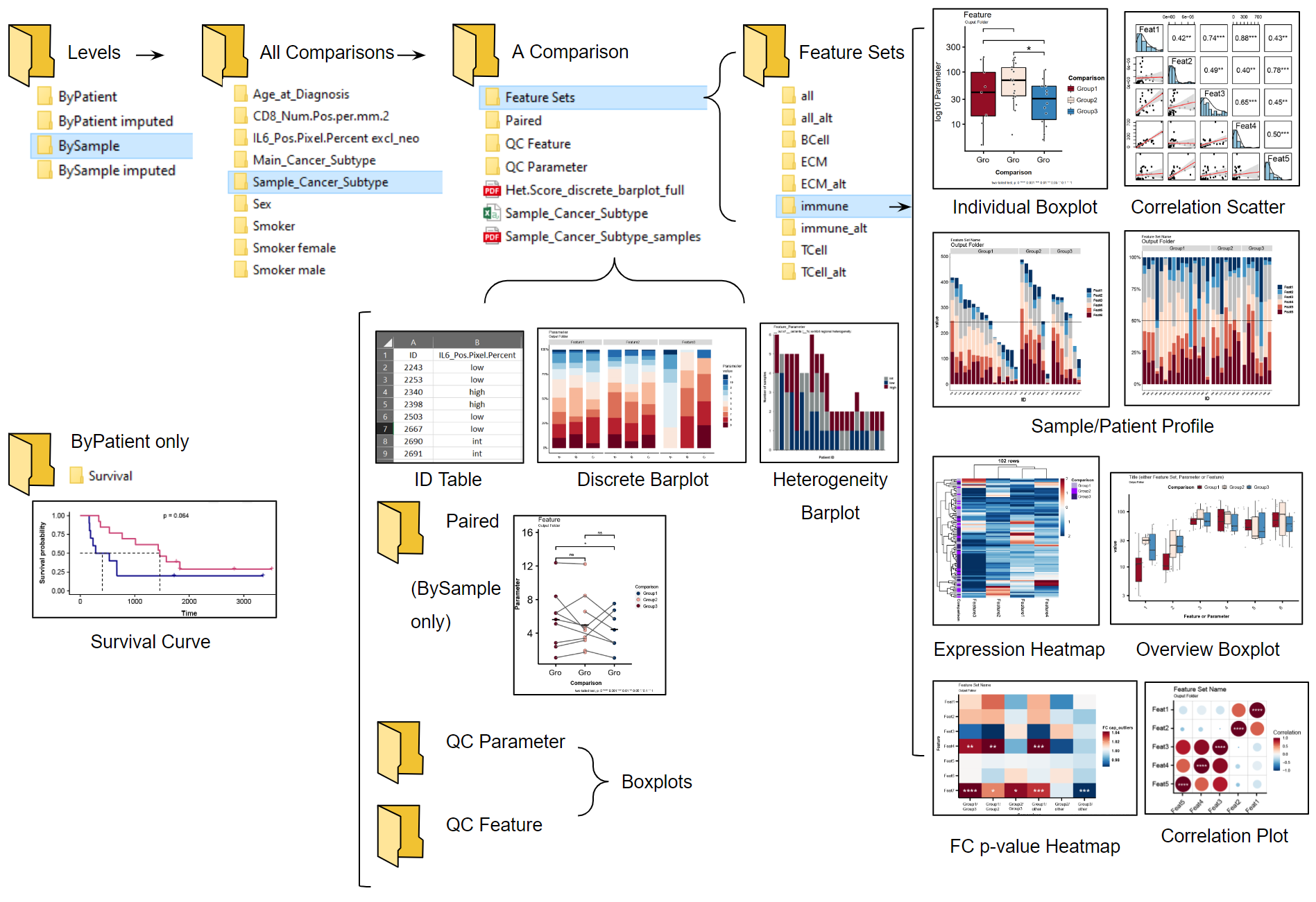
- Heterogeneity Barplot
- Visualizes sample compositon (or expression levels within samples) in patients, indicative of intrapatient heterogeneity.
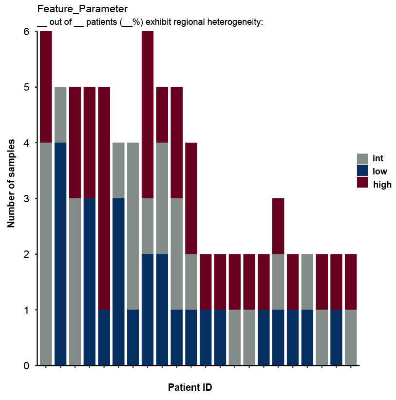
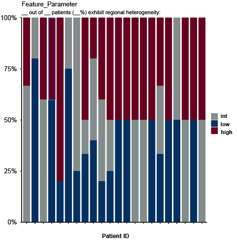
Figure 7.2: Heterogeneity barplot stacked (first image) and filled to 100% (second) created by Hourglass.
- Survival Plot
- Determines survival outcome via plotting of Kaplan Meier curve, logrank test, and tables containing patient counts. Only performed on patients (not samples).
Figure 7.3: Survival curve created by Hourglass.
- Paired Patient Slopegraph
- Enables screening of any intra-patient differences that may be reflective of heterogeneity. Points are averaged values across strata per patient. Lines connect different averages within patients.
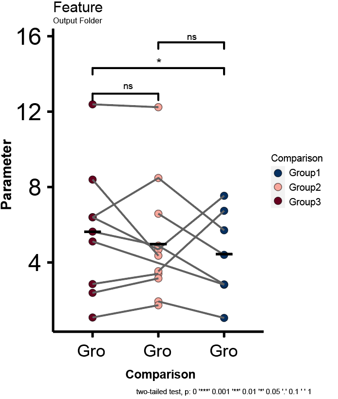
Figure 7.4: Patient paired plot created by Hourglass.
- Discrete Barplot
- Visualizes discrete values of a parameter in each stain, that is, numeric in the input data but should be considered discrete. E.g. A parameter called “Heterogeneity Score” contains values 1-10 but should be “1”, “2”, .. “10”.
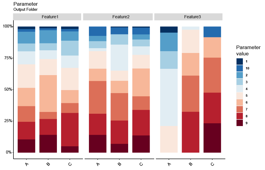
Figure 7.5: Plot showing discrete parameters created by Hourglass.
- Overview Boxplot
- Screen primary data for interesting relationships in one plot and significance associations.
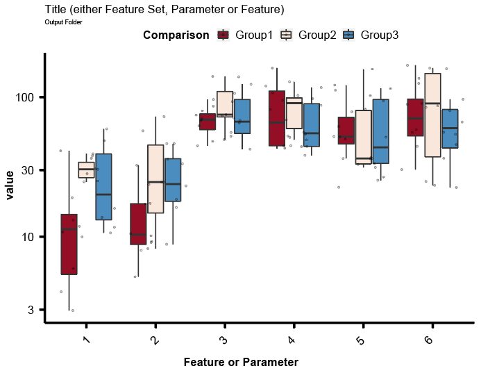
Figure 7.6: Overview boxplot with statistics created by Hourglass.
- Individual Boxplot
- Visualizes data points for each features/parameter combination and relevant statistics from comparing strata.
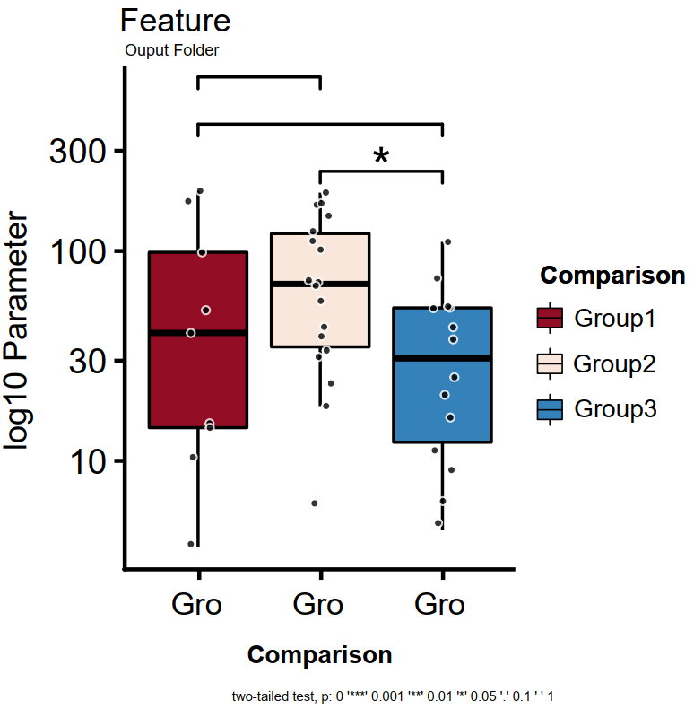
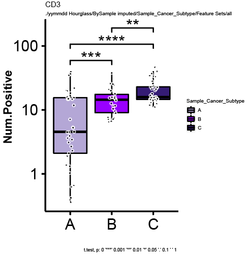
Figure 7.7: Individual boxplot (left) and example with real data (right) created by Hourglass.
- Profile Barplot
- Compare set of markers across different strata for each patient/sample.
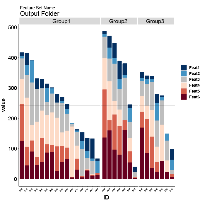
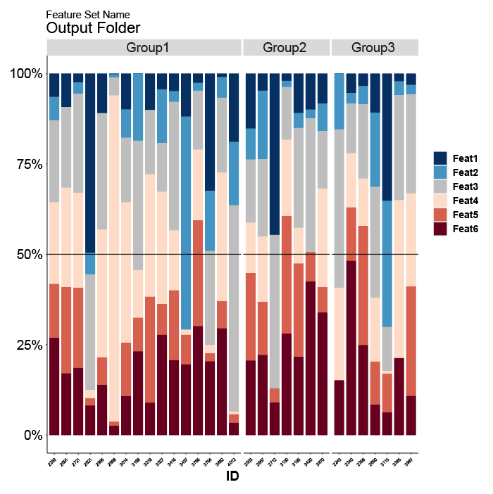
Figure 7.8: Profile barplot stacked (first) and filled to 100% (second), created by Hourglass.
- Expression Heatmap
- Provides overview of patterns in stain data. When there are no NA/missing values (in imputed version for example), values will be clustered using unsupervised hierarchal clustering.
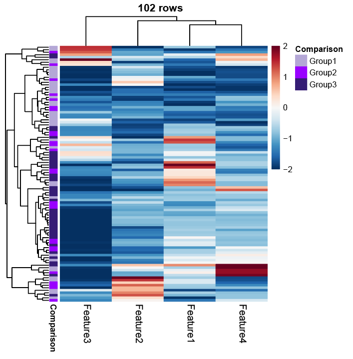
Figure 7.9: Heatmap showing expression of features, created by Hourglass.
- Fold-change (FC) p-value Heatmap
- Screen for patterns of fold-changes between strata in comparisons and overall significance seen in individuals boxplots.
- Fold-changes of strata are shown as color gradient and significance between two groups are presented as stars/numbers.
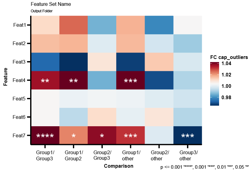
Figure 7.10: Plot showing fold-change values (color gradients) and p-values (stars/number), created by Hourglass.
- Correlation Plot
- Provides correlations between cell communities and their interactions, e.g. of an insight that can be drawn: correlations between fibroblast markers in one cancer subtype and anti-correlated with immune cells in another. Can only be performed on imputed (no missing values) dataset.
- spearman or pearson
- Only created when there are no NA/missing values - for example in 1) imputed version, and 2) “complete” rows in feature sets.
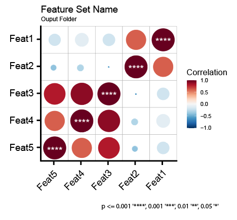
Figure 7.11: Correlation plot created by Hourglass.
- Correlation Scatter Plot
- Provides details of correlations, such as regression, scatter plots, correlation coefficients and significant and histograms of values used. Can only be performed on imputed (no missing values) dataset.
- Only created when there are no NA/missing values - for example in 1) imputed version, and 2) “complete” rows in feature setsc
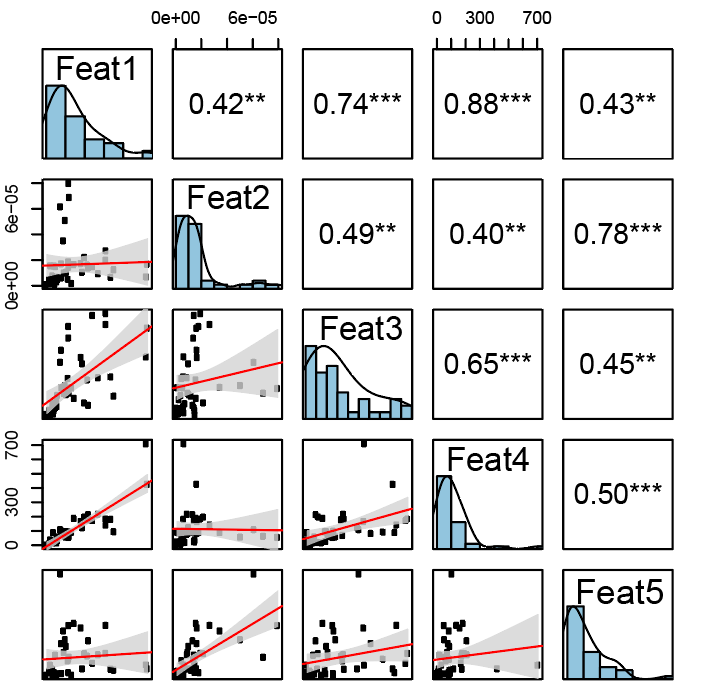
Figure 7.12: Correlation scatter plot created by Hourglass.
- ID Table
- Provides sample/patient ID and strata used in comparison, useful for custom comparisons (where groups are assigned by Hourglass) and to see which samples/patients were included after filter inclusion/exclusion.
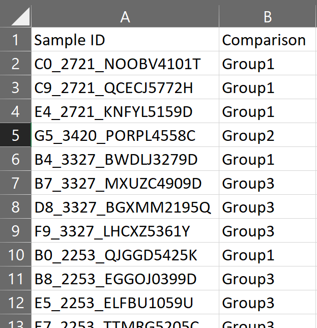
Figure 7.13: ID table (csv file) created by Hourglass.
7.3 File Information and Location
See table below for details about the output files in the Hourglass output folder hierarchy.
Note for Folder Path:
- 0 = main output folder created by Hourglass in working directory, YYMMDD Hourglass, where YYMMDD = date of run, e.g. 250721 (Jul 21, 2026).
- 1 = BySample, BySample imputed, ByPatient, ByPatient imputed.
- 2 = comparison name, e.g. Sex.
- 3 = feature set name, e.g. Tcell markers.
Note for Filename:
- [comparison] = e.g. Sex.
- [feature] = e.g. IL6.
- [parameter] = e.g. Num.Positive.Pixels.
- [feature set] = e.g. Tcell markers.
| Plot | Folder Path | File Name | R Function | ||
|---|---|---|---|---|---|
| Heterogeneity Barplot | 0/BySample/2/ | [comparison]_samples.pdf | plot_het_barplot() |
||
| Survival Plot | 0/ByPatient/Survival/2/ | [comparison]_survplot.pdf | plot_surv_curve() |
||
| Paired Patient Slopegraph | 0/BySample/2/Paired/ | [feature]_paired.pdf | plot_indiv_paired() |
||
| Discrete Barplot | 0/BySample/2/ and 0/ByPatient/2/ | [parameter]_discrete_barplot_full.pdf | plot_discrete_barplot() |
||
| Overview Boxplot | 0/1/2/QC Parameter/, 0/1/2/QC Feature/, 0/1/2/Feature Sets/3/ | [parameter]_boxplots.pdf, [feature]_boxplots.pdf, [feature set]_boxplots.pdf | plot_overview_boxplot() |
||
| Individual Boxplot | 0/1/2/QC Parameter/, 0/1/2/QC Feature/, 0/1/2/Feature Sets/3/ | [parameter]_boxplots.pdf, [feature]_boxplots.pdf, [feature set]_boxplots.pdf | plot_indiv_boxplot() |
||
| Profile Barplot | 0/1/2/Feature Sets/3/ | [feature set]_profile.pdf | plot_profile_barplot() |
||
| Expression Heatmap | 0/1/2/Feature Sets/3/ | [feature set]_heatmap.pdf | plot_heatmap() |
||
| Fold-change (FC) p-value Heatmap | 0/1/2/Feature Sets/3/ | [feature set]_pval_FC.pdf | make_FC.pval_df(), make_FC.pval_plot() |
||
| Correlation Plot | 0/1 imputed/2/Feature Sets/3/ | [feature set]_corrplot.pdf | plot_corrplot(), plot_corrplotgg() |
||
| Correlation Scatter Plot | 0/1 imputed/2/Feature Sets/3/ | [feature set]_corrplot.pdf | plot_corrscatt() |
||
| ID Table | 0/1/2/ | [comparison].csv |
7.4 Quality Control (QC) Plots
Purpose:
- Informs whether anything is skewed in a comparison. For example, the overall number of positive cells for that stain is higher in high groups (a problem).
- Verify that a specific metric or data point exists for a stain.
- Visualized using boxplots (individual and overview).
Types:
- QC Feature: Plot all parameters present for a feature, split by comparison. Note: If your “feature column” parameter is called “Stain”, this folder will be called “QC Stain” in the output folder.
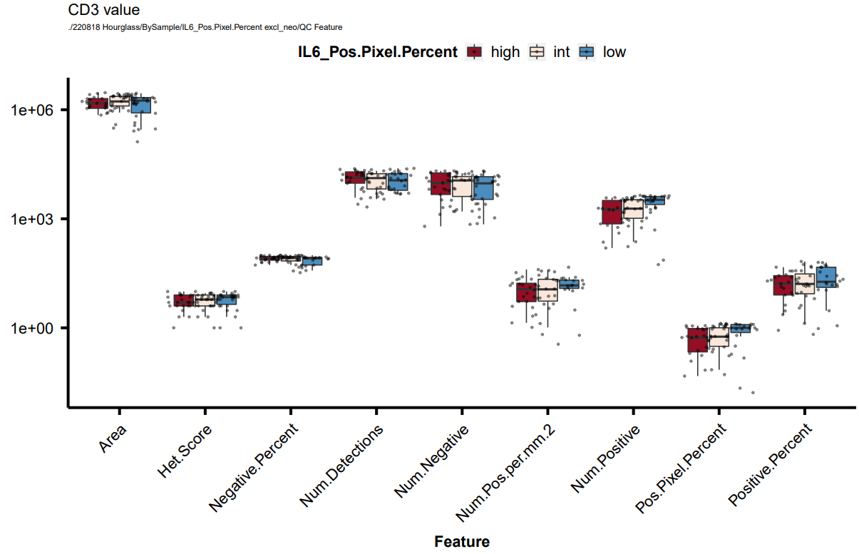
Figure 7.14: Example of a ‘QC feature’ overview boxplot (all parameters measured for CD3).
- QC Parameter: Plot all features present for a parameter, split by comparison
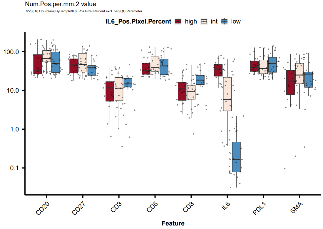
Figure 7.15: Example of a ‘QC parameter’ overview boxplot (all features that have a readout for Num.Pos.per.mm.2).
7.5 Feature Sets Plots
Purpose:
- Group relevant features (e.g. biologically relevant).
See Define Feature Sets for workflow/user specifications. Briefly:
Step 1: Specify relevant parameters for each stain.
- If multiple parameters are present per feature (usually the case in multiparametric imaging data), most will be irrelevant/for QC. The final readout is usually a ratio: (1) /(2), where (1) is quantification metric and (2) is normalization metric.
Step 2: Make sets.
- Look at a stain in context of other stains within the dataset. Create smaller groups (e.g. T cell, immune, stromal cell features).
- Multiple plot types are supported for feature sets.